

Eye Chart Test in a Taxi App: Everyday Usability Challenges
March 15, 2025 12:09 pm

Eye Chart Test in a Taxi App: Everyday Usability Challenges Whenever
Whenever I use the FREENOW app to get a taxi, I feel like I'm in an eye test, looking at the eye chart and trying to read the tiny number that indicates the taxi number.
Who has never struggled with that situation in an eye test?
But when we get a taxi, needing to read one of the most crucial pieces of information so you don't get the wrong cab, it becomes a problem. Taxi apps are emerging in the market. Companies are developing them, and users prefer them to hailing a cab on the street.
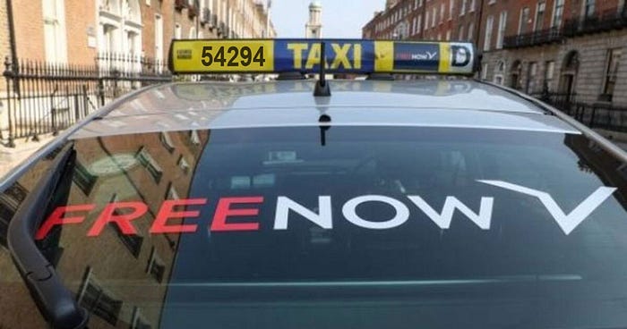
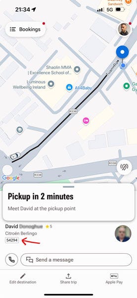
Although the number on top of the taxi is easily readable from a distance, the number displayed in the app that users need to double-check if they're getting into the correct cab is tiny.
This issue affects not just those who wear glasses like me but anyone, regardless of their eyesight.
So, why is such important information displayed so small? Also, there is no element to help this data stand out, no colour, no bold, just the tiny number in a light grey border.
Getting into the wrong cab may seem unlikely, but this happens often. I've spoken with drivers who have shared stories about passengers entering their taxis, mistakenly believing they had the right one because it was the same model.
Many people don't bother checking the cab number, which makes relying solely on the car's brand a risky mistake.
So we've got a problem there. I wonder if people are relying on the car model over the number because the numbers are too tiny to see.
Share on Social